The team were recently asked how we make our tables responsive in WordPress. That is an excellent question… so here’s some advice. Responsive HTML table designs can be challenging but with solid foundations your structure will be sound. Keep reading for the advanced tips.
What is a responsive design and why do I need it?
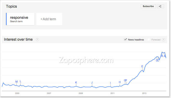
Responsive web design is a relatively new 21st century trend in website design that has become more prominent with the global increase in smart phone surfing. A responsive design is one that essentially adapts to the users browsing device. So whether a user is browsing your site from a desktop computer or tablet or smart phone the fundamental layout or design structure elegantly moulds for a perfect fit. A good example of a responsive design is not one that does not need to change everything but has been built in such a way that only a few small changes are needed. Flexibility is key. Here a graph showing the popularity of the search term “responsive” on Google Trends.
Creating responsive HTML table designs – the basic principles
One of the fundamental keys to creating a responsive design of anything is to limit the amount of specific width and height attributes. Particularly explicit pixel dimensions. So when trying to create a responsive table, flexibility can be built in by replacing specific dimensions with more general max-width, max-height or percentage % values. So, for example, rather than specifying a table to have a specific width of 600px and each of the two columns to be 300px wide. eg…
<table style="width:600px;">
  <tr>
    <td style="width:300px;"></td>
    <td style="width:300px;"></td>
  </tr>
</table>
You could set the table width to be 100% or have a maximum width of 600px. Then set each column to be 50%. A width of 100% will fill the available space it sits in as defined by its parent element.
<table style="width:100%;">
  <tr>
    <td style="width:50%;"></td>
    <td style="width:50%;"></td>
  </tr>
</table>
To style this using a separate CSS, the HTML code would be this:
<table class="responsive">
  <tr>
    <td></td>
    <td></td>
  </tr>
</table>
and the CSS would be this:
.responsive { width:100%; }
.responsive td { width:50%; }
The result is something like this.
| Cell | Cell |
| Cell | Cell |
This is a very simple example, so let’s talk next about when it becomes a little more difficult.
Tables with images – fixed or flexible
Sometimes you can’t always avoid needing to specify a pixel dimension value to a particular column or row particularly if you’ve got images to place inside. There are two methods depending on the results you want to achieve.
Fixed size images
If you’ve got relatively small images to insert in a cell, column or row you can set the minimum-width or minimum-height attribute of a table cell in pixels. The image will in turn display to the correct size and won’t scale down, despite what % width attributes are applied to other columns. Browsers are particularly good at finding a good mathematical compromises even if you have a column with a fixed width of say 170 pixels and two other columns that are set to 50%, the remainder space will be neatly divided into two if the total table width is also set to 100%. For example…
 |
Cell | Cell |
| Cell | Cell | Cell |
Flexible size images
Alternatively, if you’ve got relatively large images that you do want to scale up or down with the table then you may need to override any specific width and height attributes applied to the image and set them both to ‘auto’. Most good WordPress themes should do this automatically and your images will scale perfectly to the cell size rather than force the cell bigger and ruin your page layout. Try this:
<img src="http://www.zaposphere.com/image.jpg" alt="image" style="width:auto; height:auto;" />or this:
.responsive img { width: auto; height:auto; } |
Cell |
| Cell | Cell |
Calculation with cell padding
Another thing you’ll need to take into consideration is cell padding. Padding adds to the total calculable width and height of a table. A cell that is 100 pixels wide with 10 pixels padding added is now 120 pixels wide. Likewise a table cell which is 50% wide with 10 pixel padding isn’t necessarily going to be 50% anymore and largely depends on the relative size and padding value of the other cells in its row.
TIP: Try using percentage % values for table cell padding. This requires styling in CSS and should not to be confused with the archaic inline cellpadding attribute.
So rather than:
<table cellpadding="10">
 <tbody>
  <tr>
   <td></td>
   <td></td>
  </tr>
 </tbody>
</table>
Try this:
<table class="responsive">
 <tbody>
  <tr>
   <td></td>
   <td></td>
  </tr>
 </tbody>
</table>
.responsive td { padding:5%; }With responsive foundations in place, setting a specific amount of pixels for cell padding should be fine in most cases. The best advice we can give is to experiment with our suggestions and find what works best in your situation.
Stacking table cells on top of one another
A trick that we’ve employed in certain situations is CSS’s ability to stack table cells one on top of each other for narrower devices. Smart phone browsers will force text into narrow spaces. This can lead to ugly text wrapping issues. To overcome this you can force table cells to stack one on top of the other rather than appearing side by size. This method essentially breaks the structure of the table and is usually only suitable for small two or three column tables where it isn’t critical for the information to be read horizontally. So here’s what you do… Decide at what point you want to break the table. So for screens widths above x pixels keep the layout as normal. With screens sizes of widths below x pixels stack cells. So if you want smart phones to stack but not desktops and tablets try this:
@media screen and (max-width: 650px) {
.responsive td { display:block; }
}
This style will only take affect if the screen size on the user’s device is set to 650 pixels or lower. As technologies progress the point of change may also need to change, but for now this works great. Personally I think tablets are of high enough screen resolution to not warrant a change to the stacking method. Below shows an example of the stacking principle. We have three images each in their own table cell. They start to stack on top of one another when the browser window shrink below a certain size.
 |
 |
 |
To test the stacking functionality of the sample table above try altering the width of your browser window. Now that’s a responsive table design.
TIP: If your table cells contain just images, say in a thumbnail grid or gallery you could try setting the CSS attribute to display:inline; This creates a more flexible approach to stacking. Try it for yourself to see the results.
Using data attribution labels to replace the header information
New tricks on the block – responsive design generation
The following more advanced variation on the stacking method is appropriate for simple data tables. By stacking table cells you can sometimes separate content from meaning. This can be due to column headers stacking way above cell content. It is essential that we retain information integrity with a flexible responsive table design. So, to get around this cell separation we can add a bit of extra markup in the HTML to re-attach table cells to their particular column headers.
<table class="responsive">
 <thead>
  <tr>
   <th>First Name</th>
   <th>Occupation</th>
   <th>Hobbies</th>
  </tr>
 </thead>
 <tbody>
  <tr>
   <td data-label="First Name">Tom</td>
   <td data-label="Occupation">Actor</td>
   <td data-label="Hobbies">Scientology</td>
  </tr>
  <tr>
   <td data-label="First Name">Miley</td>
   <td data-label="Occupation">Singer</td>
   <td data-label="Hobbies">Twerking</td>
  </tr>
 </tbody>
</table>
@media screen and (max-width: 650px) {
.responsive tr {
display:block;
border-bottom: 1px solid #333;
}
.responsive td {
display:block;
position:relative;
padding-left:50%;
}
.responsive td:before {
content: attr(data-label);
position:absolute;
width:45%;
padding-right:5%;
white-space:nowrap;
left:8px;
top:8px;
font-weight:bold;
}
.responsive thead tr {
position:absolute;
left:-9999px;
}
}So what we’ve added is the column header information inside each table cell (td). In the CSS we’ve set rows and cells to display:block; to stack them. A border is used to redefine the end of each row. Padding is added to the left of each cell for the new data label. The ‘white-space’ has been set to ‘nowrap’ to prevent a text-wrapping and the table header has been accessibly removed from sight (off the screen) as it is being replaced.
The result is something like this.
| First Name | Occupation | Hobbies |
|---|---|---|
| Tom | Actor | Scientology |
| Miley | Singer | Twerking |
| Bilbo | Burglar | Writing |
| Bruce | Businessman | Vigilante |
| Clark | Journalist | Flying |
What if stacking cells isn’t appropriate? Try content overflow.
Stacking cells isn’t always the best fit for all situations, particularly for data tables with many columns. Unfortunately there is no perfect one-size fits all solution. The following option places the table within a container that will automatically add scrollbars for narrow screens. The HTML markup:
<div class="table-container">
 <table>
  <tbody>
   <tr>
    <td></td>
    <td></td>
   </tr>
  </tbody>
 </table>
</div>
and the CSS would be this:
.table-container { overflow:auto; -webkit-overflow-scrolling: touch; }
.table-container td { white-space: nowrap; }
For example:
| This is a table cell | This is a table cell | This is a table cell | This is a table cell | This is a table cell | This is a table cell | This is a table cell |
| This is a table cell | This is a table cell | This is a table cell | This is a table cell | This is a table cell | This is a table cell | This is a table cell |
This is probably the cleanest and simplest method for a responsive strategy, but as we all know, not all tables are the same. Their size, shape, rigidity and flexibility allowances differs. Just because one strategy works for one person doesn’t mean it’ll work as well for your needs. Just keep an open mind. Experiment with a few options. Pick the best. I hope you’ve found this article useful. Please add any comments below or sign up to receive email notifications of new posts from us. We will continue to publish a wide range of useful info for all website users.
We’d love to know what topics you’d like us to cover!
Testing your site’s responsiveness
A great tool for testing your website’s responsiveness without needing to own every type of mobile/tablet device is ProtoFluid. Although ProtoFluid does not exactly simulate mobile devices, it does provide an acceptable approximation.
Summary
- Don’t be specific with pixel dimensions – use max-width, max-height and % values instead.
- Prevent image scaling by adding min-width and/or min-height values.
- Retain image scaling by setting width and height to auto.
- Cell padding adds to the total width and height calculations. (Margins on the otherhand do not).
- Stack table cells with display:block; (or display:inline; for a flexible wrapping effect).
- Add data attribution labels to re-attach individual cells with their table column header counterpart. (remember to accessibly hide the header out of view as well)
- Try adding a container div around your table and set it to overflow:auto; for a contained scrolling effect.

I have looked at a lot responsive table designs. Yours is the best: it is the simplest; it is brilliant. I would like to see a few additional features, but this works very nicely for now.
Wordpress needs a responsive tables plugin like the one described here.
I believe that you are the right one to ask to do the following.
What I describe will work with all tables including standard data tables and the type of tables on my WP development website at:
s-matrix.com/~smtrxgrp/efficient-energy-use (tables are in the accordion tabs)
currently on a sub-domain of my server domain s-matrix.com.
My tables are just HTML tables that inherit my theme styles. They look good for my purposes and have all the functionality that I want. They are responsive except for width that can be scrolled – see website on a smartphone.
The best responsive table design for me would be an excel spreadsheet look alike built by making HTML tables responsive in the following way:
1. Open the table in a responsively sized container window on any device
2. Horizontal and vertical scroll bars to look at all parts of the table in the window; vertical height selectable or not
3. Any other suitable navigation aids
4. Ability to select a set of rows and columns to remain fixed as headings as the table is scrolled
5. Data table search and sort functionality
6. Ability to re-size content down to the cell level within the window
7. Use either HTML or TablePress to initially create the tables using theme CSS defaults; add the responsive window code as a shortcode or a class
8. Automatic responsive fit to portrait or landscape orientation
My company The S-MATRIX Group is a STEM contracting | consulting company.
I am a physicist with majors in engineering science, mathematics, electronics, computer science.
My PhD is in Quantum Field Theory.
Regards, Robert Selvage
It would be very useful to make the Table Title (“comment”) and Column Headings (“thead”) “sticky” as you vertically scroll the Table using the device (Smartphone, etc) scrolling functionality.
It would not appear to be necessary to make the Table Container vertically scrollable.
An excellent design model for Responsive HTML Tables is the Excel spreadsheet.
Thank you for comments. Sticky headings is a great idea as well as your other suggestions for the ideal responsive table. Zaposphere will endeavour to tackle these suggestions head-on in a future post. Watch this space…
You are perfect and have made my day, I can now happily get rid of a table plugin.. Thank you.
BTW your code worked like charm!!
Awesome! I’m glad you found this post useful. ^_^
Thank You!